Last year’s WordPress TwentyNineteen theme does nice things with the featured image in more than one level. The default wasn’t exactly what I was looking for though and some tweaks were necessary for me to feel happier. In particular I felt that the way featured images are displayed needed an adjustment.
There are three areas we can adjust:
- the colour overlay
- the opacity of the overlay
- the darkened filter effect
The Colour Overlay
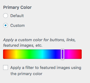
The colour overlay can be changed in the Theme Customiser. Under Appearance – Customise – Colors there’s an option to set the accent colour, which is also applied as an overlay to each featured image. Untick the box and the colour won’t be applied to your images.

The Overlay Opacity
By default the image is darkened quite a bit to make the white headline font more readable. They’ve overdone it a bit I think, making every image a hard contrasty shadow of its former self. That’s especially annoying if you’ve spent a lot of time crafting your own colour scheme and contrast. To soften the whole thing, we can adjust the opacity of the darkened image to make it look a little lighter, while not deviating too much from the character the theme authors had intended.
Add this piece of CSS and adjust the opacity value to your liking (I find that 0.9 or 0.8 work quite well).
.site-header.featured-image {
    opacity: 0.9;
}
The Dark Filter Opacity
While the above trick works on the whole (darkened) image, we can go one step further and leave the image opacity intact and only influence the dark filter. By making it less intense, more of the original image character will come out. Again, I find an opacity value of 0.9 or 0.8 works nicely. The lower you make it, the more dark filter gets removed. Choose 0 to get rid of it entirely.
.site-header.featured-image:after {
    opacity: 0.8;
}
I hope this was helpful.
