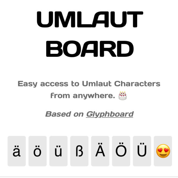
I’ve just released UMLAUTBOARD, a super simple single-page mobile friendly website that allows anyone to copy German Umlaut characters to their clipboard. Let me tell you a little about why I made this, how it works, and how ya’ll can expand it if you want. And here’s what it looks like:

What is UMLAUTBOARD?
The idea is very simple: it’s a fixed page with umlaut characters at the bottom. Click on one, and the respective character is copied into the current device’s clipboard. Now navigate to where you need that character and paste it in. This works irrespective of your operating system, mobile/desktop device or keyboard/language settings.
All you need to remember is this short URL wpguru.tv/ub. Works on any OS, anytime and anywhere.
Why did I make UMLAUTBOARD?
I frequently type in both English and German. When I’m on my Mac, or when I’m on my iOS devices, that’s usually not a problem because I have both keyboard layouts installed. Even without those additional input options, macOS and iOS make it relatively easy to hold down a single character in some application, and then let us pick a variation of it, be it accents or Umlauts.
However, that convenience isn’t always available everywhere. Windows for example doesn’t let me do this at all. Even if I can install other keyboard layouts, I’d have to do this on so many additional devices, and my current keyboards are complicated enough that I can barely remember which button prints which character. And sure, there are some (impossible to remember) modifier combinations that bring up special characters under certain circumstances, but trying them out in the heat of the moment costs time and brings headaches.
I wanted something simple, a URL I could remember, with functionality that didn’t need any explanations. I also wanted something that would work on any of the devices and operating systems I’m currently using, so a cloud-based solution sounded like a good plan.
How did you make UMLAUTBOARD?
It’s based on code by Neven Mrgan, whose work I came across many years ago when I got acquainted with the iPad. I believe Julia came across his Glyphboard, and it’s been installed on my home screens ever since. Neven’s idea was to bring difficult to find characters to an easy interface (like the Apple or copyright symbol), and his Glyphboard makes this a breeze. We didn’t always have Emjoy keyboards at our fingertips you know…
I took a look at his source code, which is all based on simple HTML and JavaScript, and thought this would be great as a basis to get started. So I sent him a Tweet, and I was thrilled when he said yes 
First I externalised the JS and CSS, added the 5 special Umlaut characters to the bottom and removed the existing Glyphboard icons. I also tweaked the visuals and gave it a white background, pulled in my favourite Subnautica font from The Google and added a link back to Neven’s original project.
To provide some additional info (ie. this post), I thought it might be nice to add a link to that too, but with minimalist projects it’s important to leave the interface as uncluttered as possible. I felt a celebratory little cake icon would be much nicer and. I liked it so much that I thought perhaps we need one additional icon to fill the extra space at the bottom right (makes it look more symmetric in portrait mode on mobiles). In the future I may even randomise that last icon upon page load.
The magic really lies in a Java Script function that is triggered as soon as the user selects a character at the bottom. At that point its value is read out and copied to the clipboard.
Can I get this on my mobile home screen?
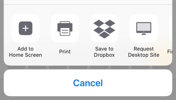
Absolutely (at least on iOS)! Press the sharing icon in Safari, then select Add to Home Screen. Moments later you’ve got something that looks just like an App Icon, and when you press this, you’ll be sent straight to Umlautboard.

What attracted you to the original Glyphboard?
I’m a sucker for simplicity (not that you could tell that by my cluttered website, or my likeminded desk for that matter). I like clean design, and that’s not easy to create. I often find apps that are “good”, but to make them “great”, you really need to spend a lot of time and play with variations of the same theme. Only then can users feel a real connection. This is so often neglected with product and software development. The devil is in the details, and the details take time.
With Glyphboard, I think I felt a connection for all these years, for that very reason. You can create something functional that’s probably “good enough” in under an hour. It’s the many hours after that, where nothing drastically changes from the original vision, where people think you’re nuts when you keep coding anyway, that’s when – sometimes – a project becomes exceptional. I wanted something like that, and Glyphboard in its simplicity ticked all those boxes.
It’s funny when I looked at Neven’s Website, and saw that he works for Panic. I’ve been using their Prompt SSH app for iOS for many years, and I felt exactly the same connection to simplicity and functionality. Like Steve Job’s said in one of his famous quotes, from when they opened that new auditorium in Cupertino, “something is transmitted there”.
GitHub Repo
If you want to take a peek at the code, I’ve put it on GitHub. Feel free to add other complex characters and make the world a better place.

 PAX (@mrgan)